Ensuring STEM Accessibility for Everyone - The Importance of Compliance with Accessibility Standards
Ensuring STEM Accessibility for Everyone - The Importance of Compliance with Accessibility Standards
Ensuring STEM Accessibility for Everyone - The Importance of Compliance with Accessibility Standards
Goal
Goal
The goal of this project was to conduct a thorough accessibility audit of the Stemettes website. The objective was to identify and address barriers that could prevent users with disabilities from fully engaging with the site, ensuring an inclusive experience for all visitors.
The goal of this project was to conduct a thorough accessibility audit of the Stemettes website. The objective was to identify and address barriers that could prevent users with disabilities from fully engaging with the site, ensuring an inclusive experience for all visitors.
Problem
Problem
Stemettes, a nonprofit focused on empowering girls, young women, and non-binary individuals in STEM, faced potential accessibility issues on their website. Without a formal accessibility evaluation, the site risked excluding up to 20% of their target audience—those with disabilities.
Studies indicate that 70% of websites fail basic accessibility tests, leading 83% of disabled users to seek alternatives. This posed a significant threat to Stemettes' mission of inclusivity. Addressing these accessibility challenges was essential to ensuring that all users, regardless of ability, could fully engage with and benefit from the resources Stemettes offers.
Outcome
Outcome
The accessibility audit identified numerous issues on the Stemettes website, including missing alt text, poor color contrast, and inaccessible navigation elements.
A comprehensive report was provided to the Stemettes team, detailing these findings and offering clear, actionable recommendations for improvement. The report was aligned with WCAG 2.1 standards, giving Stemettes the necessary insights to make their website more accessible and inclusive for all users.
Pages Evaluated
Pages Evaluated
Guidelines
Guidelines
Approach to testing
Approach to testing
Approach to testing
The accessibility audit was conducted using a comprehensive approach that combined automated tools, persona-based analysis, screen reader compatibility checks, contrast assessments, and manual observations. This method ensured a thorough evaluation of the website's accessibility from multiple perspectives, allowing for a complete understanding of the barriers faced by users with diverse needs.
The accessibility audit was conducted using a comprehensive approach that combined automated tools, persona-based analysis, screen reader compatibility checks, contrast assessments, and manual observations. This method ensured a thorough evaluation of the website's accessibility from multiple perspectives, allowing for a complete understanding of the barriers faced by users with diverse needs.
The accessibility audit was conducted using a comprehensive approach that combined automated tools, persona-based analysis, screen reader compatibility checks, contrast assessments, and manual observations. This method ensured a thorough evaluation of the website's accessibility from multiple perspectives, allowing for a complete understanding of the barriers faced by users with diverse needs.
Severity Scale
Severity Scale
Once all the errors were listed, they were assigned a severity level based on the extent to which they would affect the user journey of people with disabilities:
Once all the errors were listed, they were assigned a severity level based on the extent to which they would affect the user journey of people with disabilities:
Accessibility User Personas
Accessibility User Personas
Due to the audit's constraints, which prohibit disabled persons' direct recruitment for user interviews because of time and legal constraints, an alternative approach to investigate user personas has been employed to understand accessibility requirements.
A variety of user profiles were chosen from the Digital Accessibility Research by Gov.uk, matching Stemettes' user specifications of a young female student with diverse impairments (like visual, auditory, motor, or cognitive disabilities). This action was taken to comprehend the precise details of their disabilities and limitations, in order to pinpoint the obstacles that deter them from thoroughly interacting with the website's content and features.
Persona - 1 , Persona - 2, Persona - 3, Persona - 4
Easy Check with WAVE Accessibility Tool
Easy Check with WAVE Accessibility Tool
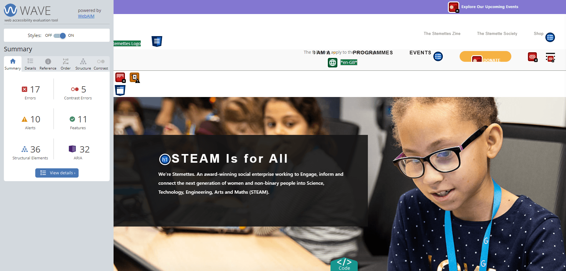
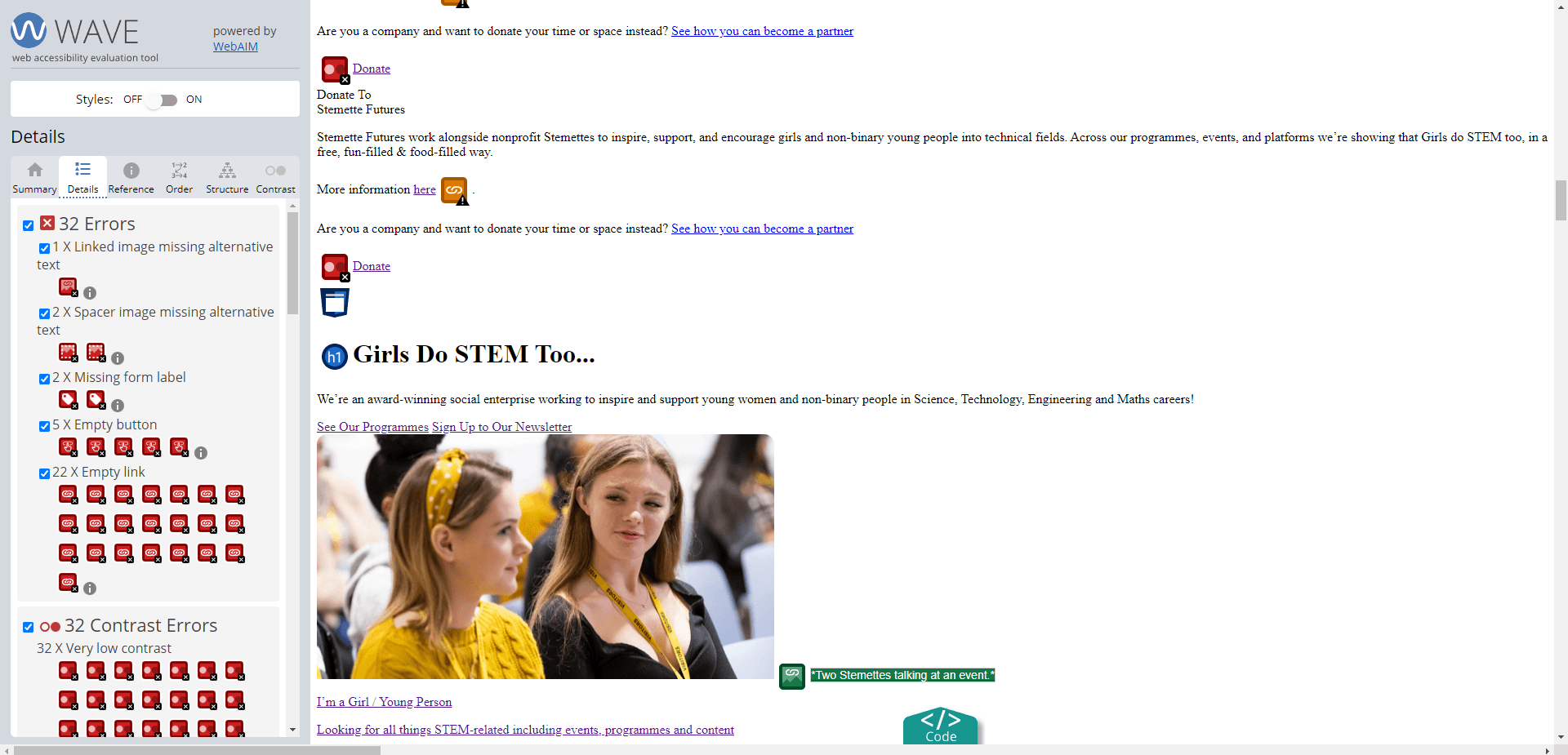
I initiated the process by utilizing the automated WAVE website accessibility appraisal tool to carry out a thorough examination of every page on the site: Homepage, Team Introduction Page, Events Page, and Newsletter page.
I initiated the process by utilizing the automated WAVE website accessibility appraisal tool to carry out a thorough examination of every page on the site: Homepage, Team Introduction Page, Events Page, and Newsletter page.

Screenshots of errors found on the webpages through WAVE Testing
Screenshots of errors found on the webpages through WAVE easy checks test.
Screenshots of errors found on the webpages through WAVE easy checks test.
Outcome
Outcome
The automated testing highlighted more than 150 issues including empty hyperlinks, absent alt text, poor colour contrast, erratic heading hierarchy, and general structure concerns. These findings provide a comprehensive snapshot of the existing problems and direct our attention to areas for targeted manual accessibility verification.
The automated testing highlighted more than 150 issues including empty hyperlinks, absent alt text, poor colour contrast, erratic heading hierarchy, and general structure concerns. These findings provide a comprehensive snapshot of the existing problems and direct our attention to areas for targeted manual accessibility verification.
Missing Skip-to-Content Links: Across all pages, there were no "skip to content" links, forcing screen reader users to navigate through every link before reaching the main content. This issue significantly increased the time and effort required to interact with the site.
Missing Skip-to-Content Links: Across all pages, there were no "skip to content" links, forcing screen reader users to navigate through every link before reaching the main content. This issue significantly increased the time and effort required to interact with the site.
Pop-up Window Issues: On the homepage, pop-up windows presented another challenge. Screen reader users had to tab through elements behind the pop-up before interacting with it, leading to confusion and inefficiency.
Pop-up Window Issues: On the homepage, pop-up windows presented another challenge. Screen reader users had to tab through elements behind the pop-up before interacting with it, leading to confusion and inefficiency.
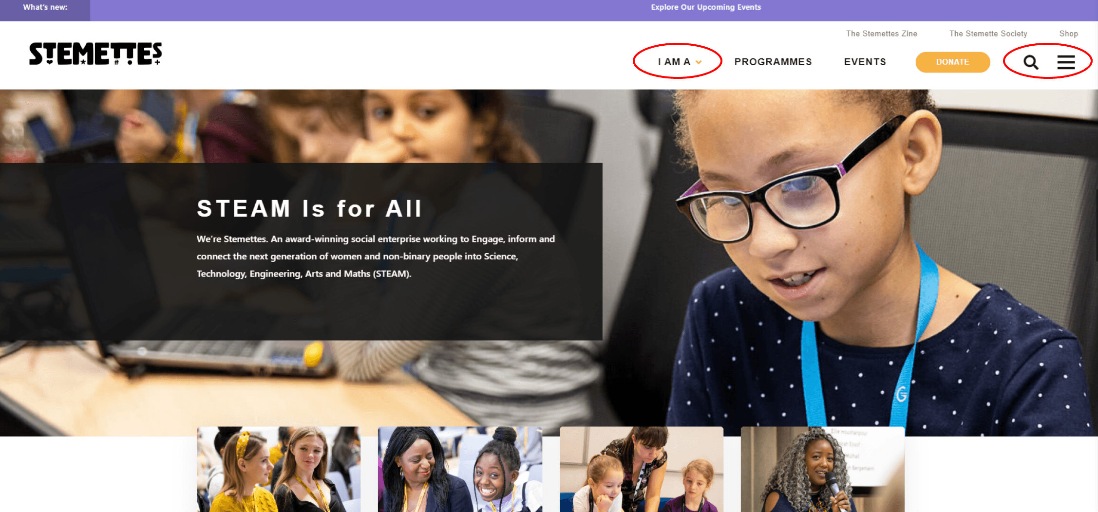
Inaccessible Navigation Elements: The main menu and newsletter sign-up page included drop-down menus that were not accessible via keyboard alone, making it impossible for users relying on screen readers to access these important sections.
Inaccessible Navigation Elements: The main menu and newsletter sign-up page included drop-down menus that were not accessible via keyboard alone, making it impossible for users relying on screen readers to access these important sections.
Empty Links and Missing Alt Text: Icons like the search, hamburger menu and the social media icons had empty links, and many images were missing alt text. These omissions meant that screen reader users were unable to understand the purpose of these elements or interact with them effectively.
Empty Links and Missing Alt Text: Icons like the search, hamburger menu and the social media icons had empty links, and many images were missing alt text. These omissions meant that screen reader users were unable to understand the purpose of these elements or interact with them effectively.
Screenreader Compatibility Test
Screenreader Compatibility Test
Outcome
Outcome
During the audit, significant issues were identified related to screen reader compatibility, which is critical for visually impaired users. The Stemettes website lacked several key accessibility features that are essential for effective screen reader navigation
During the audit, significant issues were identified related to screen reader compatibility, which is critical for visually impaired users. The Stemettes website lacked several key accessibility features that are essential for effective screen reader navigation
Contrast analysis with WebAim
Contrast analysis with WebAim
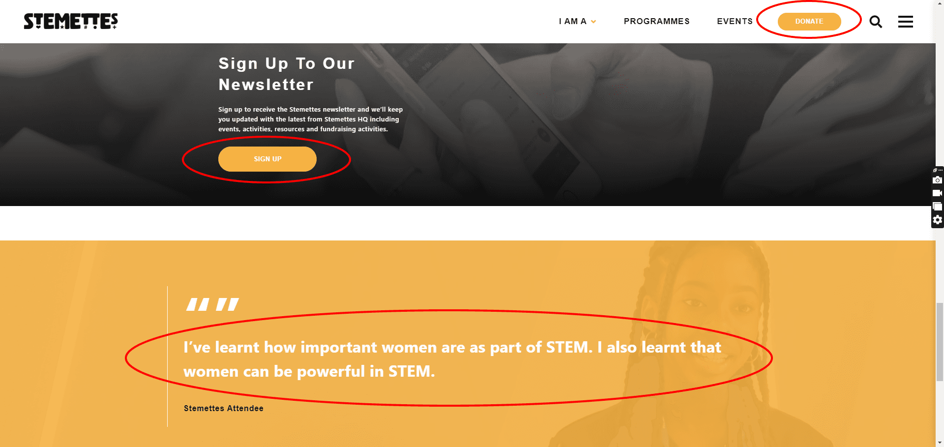
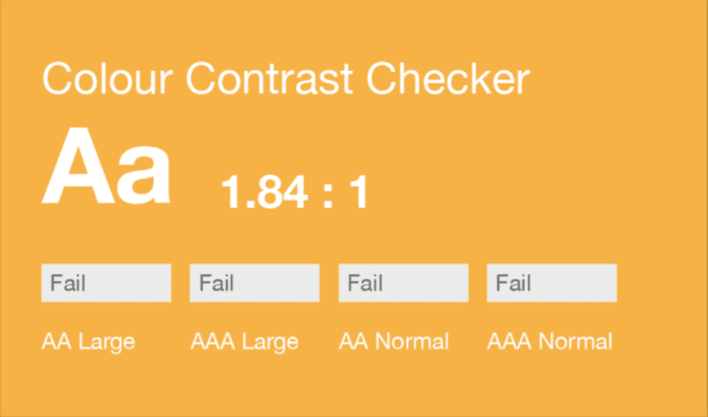
Low Contrast Ratios: Numerous elements, such as the donate link with white text on a yellow background, and buttons and links with similar colour schemes, did not meet the minimum contrast ratio of 4.5:1. In some cases, the contrast was as low as 1:1, making these elements nearly unreadable for users with visual impairments.
Low Contrast Ratios: Numerous elements, such as the donate link with white text on a yellow background, and buttons and links with similar colour schemes, did not meet the minimum contrast ratio of 4.5:1. In some cases, the contrast was as low as 1:1, making these elements nearly unreadable for users with visual impairments.
Flashing Content Risks: On the events page, several flashing images or GIFs posed a significant risk to users with photosensitive epilepsy. These elements exceeded the recommended flash thresholds, increasing the potential for triggering seizures.
Flashing Content Risks: On the events page, several flashing images or GIFs posed a significant risk to users with photosensitive epilepsy. These elements exceeded the recommended flash thresholds, increasing the potential for triggering seizures.
Inadequate Text Visibility: Text within pop-up windows, filter elements, and the quotes section on the home and events pages also failed to meet the required contrast standards, further complicating readability.
Inadequate Text Visibility: Text within pop-up windows, filter elements, and the quotes section on the home and events pages also failed to meet the required contrast standards, further complicating readability.
The contrast analysis revealed several key issues across the Stemettes website, particularly concerning the text and background color ratios. These deficiencies made it challenging for users with low vision to read and interact with the content effectively.
The contrast analysis revealed several key issues across the Stemettes website, particularly concerning the text and background color ratios. These deficiencies made it challenging for users with low vision to read and interact with the content effectively.
Outcome
Outcome
The contrast ratio was insufficient across multiple screens and sections which showed that the visual language of the site needed to be scaled.
The contrast ratio was insufficient across multiple screens and sections which showed that the visual language of the site needed to be scaled.
Observation based on WCAG 2.1 guidelines
Observation based on WCAG 2.1 guidelines
What went wrong
What went wrong
What went wrong
The accessibility audit conducted on the Stemettes website, using the WCAG 2.1 Level AA guidelines as a benchmark, uncovered several critical areas where the site did not meet the necessary standards for accessibility. These observations highlighted the need for improvements across various aspects of the website to ensure a more inclusive user experience.
The accessibility audit conducted on the Stemettes website, using the WCAG 2.1 Level AA guidelines as a benchmark, uncovered several critical areas where the site did not meet the necessary standards for accessibility. These observations highlighted the need for improvements across various aspects of the website to ensure a more inclusive user experience.
Proper Landmarks: ARIA landmarks were correctly used.
Descriptive Links: Some links were well-labeled.
Consistent Navigation: Navigation menus were consistent across pages.
Readable Font Size: Font size was generally adequate.
Proper Landmarks: ARIA landmarks were correctly used.
Descriptive Links: Some links were well-labeled.
Consistent Navigation: Navigation menus were consistent across pages.
Readable Font Size: Font size was generally adequate.
What went well
What went well
What went well
No Skip-to-Content Links: Missing on all pages.
Inaccessible Navigation: Drop-down menus not keyboard-accessible.
Low Contrast Ratios: Text and UI elements failed contrast standards.
Empty Links/Alt Text: Missing alt text and links with no purpose.
Inadequate Form Labels: 'Sort by' lacked accessible labels.
Flashing Content: Risky flashing images on the event page.
Skipped Heading Levels: Inconsistent heading structure across pages.
Improve Contrast: Adjust text and background colors to meet WCAG 2.1 contrast ratios (4.5:1 for text, 3:1 for large text).
Improve Contrast: Adjust text and background colors to meet WCAG 2.1 contrast ratios (4.5:1 for text, 3:1 for large text).
Consistent Font Size: Ensure all text sizes are readable and meet accessibility standards.
Consistent Font Size: Ensure all text sizes are readable and meet accessibility standards.
Add Skip-to-Content Links: Implement skip-to-content links on all pages for easier navigation.
Add Skip-to-Content Links: Implement skip-to-content links on all pages for easier navigation.
Make Drop-Down Menus Accessible: Ensure all drop-down menus are fully accessible via keyboard.
Make Drop-Down Menus Accessible: Ensure all drop-down menus are fully accessible via keyboard.
Recommendations
Recommendations
Once all the issues were marked out, I proceeded to recommend potential solutions for each issue detailing what improvements were needed in order to comply with WCAG 2.1 accessibility standards and incorporate inclusivity.
These recommendations were mainly sourced from the primary and secondary guidelines and research articles referenced that explained how such issues affect people with impairments and what can be done to enhance their user experience and accessibility. Below are listed some of the important recommendations:
Visual
Visual
Navigation
Navigation
Provide Alt Text: Add descriptive alt text to all images and meaningful labels to interactive elements.
Provide Alt Text: Add descriptive alt text to all images and meaningful labels to interactive elements.
Fix Empty Links: Remove empty links or provide descriptive text within them.
Fix Empty Links: Remove empty links or provide descriptive text within them.
Control Flashing Content: Limit flashing content to three flashes per second or remove it entirely to prevent seizures.
Control Flashing Content: Limit flashing content to three flashes per second or remove it entirely to prevent seizures.
Add Captions and Transcripts: Provide captions for videos and transcripts for audio content.
Add Captions and Transcripts: Provide captions for videos and transcripts for audio content.
Provide option to pause auto-moving content (gifs, videos) and give sufficient time to interact with them.
Provide option to pause auto-moving content (gifs, videos) and give sufficient time to interact with them.
Text Content
Text Content
Media Content
Media Content
Ensure Full Keyboard Access: Make sure all interactive elements, including forms and pop-ups, are accessible via keyboard.
Ensure Full Keyboard Access: Make sure all interactive elements, including forms and pop-ups, are accessible via keyboard.
Add Focus Indicators: Use visual indicators to show which element is currently in focus for keyboard users.
Add Focus Indicators: Use visual indicators to show which element is currently in focus for keyboard users.
Keyboard
Keyboard